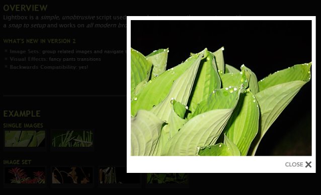
I like modal web dialogs, especially when they dim the background. Here is an example:
The background is dimmed, not clickable, and the dialog box is in the foreground. The work area is visible at first site, you must focus on the current content.
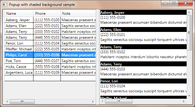
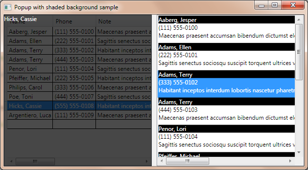
I wanted something similar in WPF. Here is my example application:
How it works?
There are two parts of the window. There is a DataGrid in the left pane and a ListBox in the right pane. The same data is loaded into both controls. When you select an item in the grid, the popup will appear over the grid, displaying the selected name. Clicking on the popup will close that. You can’t click through the popup. The right pane demonstrates that you can do anything with other controls. The popup resizes itself (drag the grid splitter to test it).
About adorners
The key component to the popup control is the adorner class of WPF. The definition of adorners from MSDN:
An Adorner is a custom FrameworkElement that is bound to a UIElement. Adorners are rendered in an AdornerLayer, which is a rendering surface that is always on top of the adorned element or a collection of adorned elements. Rendering of an adorner is independent from rendering of the UIElement that the adorner is bound to. An adorner is typically positioned relative to the element to which it is bound, using the standard 2-D coordinate origin located at the upper-left of the adorned element.
There are three types of adorners:
Adorner: An abstract base class from which all concrete adorner implementations inherit.
AdornerLayer: A class representing a rendering layer for the adorner(s) of one or more adorned elements.
AdornerDecorator: A class that enables an adorner layer to be associated with a collection of elements.
The code
The code of the popup adorner is the following:
1: using System.Windows;
2: using System.Windows.Documents;
3: using System.Windows.Media;
4: using System.Windows.Controls;
5:
6: namespace AdornerTest1
7: {
8: public class PopUp : Adorner
9: {
10: private VisualCollection _Visuals;
11: private ContentPresenter _ContentPresenter;
12:
13: /// <summary>
14: /// Initializes a new instance of the <see cref="PopUp"/> class.
15: /// </summary>
16: /// <param name="adornedElement">The element to bind the adorner to.</param>
17: /// <exception cref="T:System.ArgumentNullException">Raised when adornedElement is null.</exception>
18: public PopUp(UIElement adornedElement)
19: : base(adornedElement)
20: {
21: _Visuals = new VisualCollection(this);
22: _ContentPresenter = new ContentPresenter();
23: _Visuals.Add(_ContentPresenter);
24: }
25:
26: /// <summary>
27: /// Initializes a new instance of the <see cref="PopUp"/> class.
28: /// </summary>
29: /// <param name="adornedElement">The adorned element.</param>
30: /// <param name="content">The content.</param>
31: public PopUp(UIElement adornedElement, Visual content)
32: : this(adornedElement)
33: { Content = content; }
34:
35: /// <summary>
36: /// Implements any custom measuring behavior for the adorner.
37: /// </summary>
38: /// <param name="constraint">A size to constrain the adorner to.</param>
39: /// <returns>
40: /// A <see cref="T:System.Windows.Size"/> object representing the amount of layout space needed by the adorner.
41: /// </returns>
42: protected override Size MeasureOverride(Size constraint)
43: {
44: _ContentPresenter.Measure(constraint);
45: return _ContentPresenter.DesiredSize;
46: }
47:
48: /// <summary>
49: /// When overridden in a derived class, positions child elements and determines a size for a <see cref="T:System.Windows.FrameworkElement"/> derived class.
50: /// </summary>
51: /// <param name="finalSize">The final area within the parent that this element should use to arrange itself and its children.</param>
52: /// <returns>The actual size used.</returns>
53: protected override Size ArrangeOverride(Size finalSize)
54: {
55: _ContentPresenter.Arrange(new Rect(0, 0,
56: finalSize.Width, finalSize.Height));
57: return _ContentPresenter.RenderSize;
58: }
59:
60: /// <summary>
61: /// Overrides <see cref="M:System.Windows.Media.Visual.GetVisualChild(System.Int32)"/>, and returns a child at the specified index from a collection of child elements.
62: /// </summary>
63: /// <param name="index">The zero-based index of the requested child element in the collection.</param>
64: /// <returns>
65: /// The requested child element. This should not return null; if the provided index is out of range, an exception is thrown.
66: /// </returns>
67: protected override Visual GetVisualChild(int index)
68: { return _Visuals[index]; }
69:
70: protected override int VisualChildrenCount
71: { get { return _Visuals.Count; } }
72:
73: /// <summary>
74: /// Gets or sets the content.
75: /// </summary>
76: /// <value>The content.</value>
77: public object Content
78: {
79: get { return _ContentPresenter.Content; }
80: set { _ContentPresenter.Content = value; }
81: }
82: }
83: }
You can set a content for the popup adorner, and that is all what I want. The VisualCollection is responsible for rendering the content on screen, and the ContentPresenter is responsible for storing the popup’s content.
There is a BackgroundShade user control to represent the dimmed background. The code is very short and simple:
1: <UserControl
2: [...]
3: Background="Black"
4: Opacity="0.705">
5:
6: <Grid x:Name="LayoutRoot"/>
7: </UserControl>
I set the background to black at line 3 and I set the opacity of the control to 70% at line 4.
The Main window layout:
1: <Window
2: xmlns="http://schemas.microsoft.com/winfx/2006/xaml/presentation"
3: xmlns:x="http://schemas.microsoft.com/winfx/2006/xaml"
4: xmlns:Custom="http://schemas.microsoft.com/wpf/2008/toolkit" xmlns:d="http://schemas.microsoft.com/expression/blend/2008" xmlns:mc="http://schemas.openxmlformats.org/markup-compatibility/2006" xmlns:AdornerTest1="clr-namespace:AdornerTest1"
5: x:Class="AdornerTest1.MainWindow"
6: x:Name="Window"
7: Title="Popup with shaded background sample"
8: Width="640" Height="480" mc:Ignorable="d">
9:
10: <Window.Resources>
11: <DataTemplate x:Key="ItemTemplate">
12: <StackPanel>
13: <TextBlock Text="{Binding Name}" Background="Black" Foreground="White"/>
14: <TextBlock Text="{Binding Phone}"/>
15: <TextBlock Text="{Binding Note}" Margin="0 0 0 8"/>
16: </StackPanel>
17: </DataTemplate>
18: </Window.Resources>
19:
20: <Grid x:Name="LayoutRoot" DataContext="{Binding Source={StaticResource SampleDataSource}}">
21: <Grid.ColumnDefinitions>
22: <ColumnDefinition/>
23: <ColumnDefinition MinWidth="10" Width="Auto"/>
24: <ColumnDefinition/>
25: </Grid.ColumnDefinitions>
26: <Custom:DataGrid x:Name="Grid" ItemsSource="{Binding Collection}" AutoGenerateColumns="True" SelectionChanged="Grid_SelectionChanged" />
27: <GridSplitter HorizontalAlignment="Stretch" Grid.Column="1"/>
28: <ListBox x:Name="List" Grid.Column="2" ItemTemplate="{DynamicResource ItemTemplate}" ItemsSource="{Binding Collection}" d:LayoutOverrides="GridBox"/>
29: </Grid>
30: </Window>
The Main window code:
1: using [...]
2:
3: namespace AdornerTest1
4: {
5: public partial class MainWindow : Window
6: {
7: public MainWindow()
8: { [...] }
9:
10: BackgroundShade shade;
11: PopUp adorner;
12:
13: private void Grid_SelectionChanged(
14: object sender, SelectionChangedEventArgs e)
15: {
16: // Create adorner
17: AdornerLayer layer = AdornerLayer.GetAdornerLayer(Grid);
18: adorner = new PopUp(Grid);
19:
20: // Close adorner
21: adorner.MouseLeftButtonDown += delegate
22: {
23: layer.Remove(adorner);
24: };
25: ((FrameworkElement) adorner.AdornedElement).
26: SizeChanged += AdornedElement_SizeChanged;
27:
28: // Create shaded background
29: shade = new BackgroundShade();
30: AdornedElement_SizeChanged(this, null);
31:
32: // Create text
33: TextBlock text = new TextBlock();
34: text.Foreground = Brushes.White;
35: // Bind text to selected item
36: Binding binding = new Binding("Name");
37: binding.Source = Grid.SelectedItem;
38: text.SetBinding(TextBlock.TextProperty, binding);
39: // Register text
40: shade.LayoutRoot.Children.Add(text);
41:
42: // Display adorner
43: adorner.Content = shade;
44: layer.Add(adorner);
45: }
46:
47: /// <summary>
48: /// Adorned element's size changed
49: /// </summary>
50: void AdornedElement_SizeChanged(object sender, SizeChangedEventArgs e)
51: {
52: shade.Width = adorner.AdornedElement.RenderSize.Width;
53: shade.Height = adorner.AdornedElement.RenderSize.Height;
54: }
55: }
56: }
The implementation details are in the comments. One interesting thing: I couldn’t simply bind the AdornedElement’s RenderSize to the shade’s width property, so it seems simpler to convert the AdornedElement to FrameworkElement and attach an event handler to the SizeChanged event.
You can download the source and the binaries from Google code, or you can simply browse source at the same place. Links are below.
Link: Demo source [Google Code]
Link: Demo executable [Google Code]
Link: Browse source [Google Code]


